Using the “Box Model” to Create a Layout with Columns

(In this Lesson we will review the CSS Box Model and see how it is used to create an attractive column style layout with no tables involved. You can download and use the template discussed here, in your own work.)
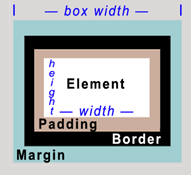
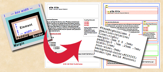
1. First, let’s review the CSS “Box Model” concept. Take a look at the picture of it at right. When you first code an element into your layout using CSS, where an element might be a paragraph, or a DIV, you have a number of controls that create a series of “boxes” around it.
You can set the elements height and width — the first box. Then you can set padding — creating a second box. You can add a border — a third box, and finally, you can add a margin around your new element, for a fourth box. Can you guess how many boxes I used for the graphic at right? Well you won’t have to guess anymore after reading this tutorial.
2. Make sure you have installed the latest version of the excellent Web Developer FireFox Add-on by Chris Pederick – a must have FireFox extension for the Open Source WebMaster. We’ll use this tool to understand visually the structure of our CSS layout, and to access the actual CSS code. If you already have it, make sure it’s updated… the interface has changed a bit recently.
When you load Web Developer into FireFox, it installs as both a toolbar (which I prefer, and will be shown in the illustrations below), and also a set of menu options under the FireFox “Tools” menu.
3. Next we’ll be analyzing and applying our Box Model Concept to a simple fixed 1-column layout at the CSS Tinderbox — an open source site with excellent templates you can use royalty free. Download the template for this lesson (click), in ZIP format. Open the HTML file in the template in your FireFox browser so you can use the Web Developer extension to analyze it.
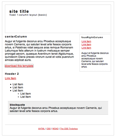
Above is a screenshot of the layout we’re going to analyze. Note that the author has used borders which not only serve as design elements, but also help us visualize the CSS element “box” areas in the layout. Many webmasters like to turn on borders for elements during the design process to help them visualize the structure of their CSS… even if you decide to turn them off later.
4. Now here’s the fun fun part… using the Web Developer extension to help you see exactly where the box model is used in this layout. Sure, you can see them initially because of the borders the author used. But what if there were no borders? Many web page designs do not call for borders. And, how can you easily locate an element in a long list of CSS code? It’s a snap when you use Web Developer to help you.
Turn on “Outline Block Level Elements” on the “Outline” drop-down menu. Right away you can see a visual outline of the CSS element structure for this layout.
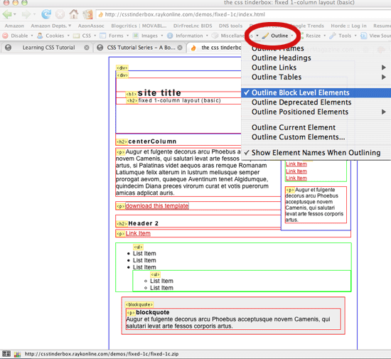
Above, your CSS element structure is outlined with a specific color scheme in the Web Developer extension: Headings and Paragraphs in Red, DIVs in Blue, and Lists in Green.
5. Next, turn on “Display ID & Class Details” under the Information Menu. This gives you the IDs used for the columns in this layout (“centerColumn” and “fauxRightColumn”) so you can find them in the CSS code later.
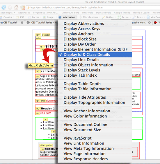
Above, turning on “Display ID & Class Details” as described, gives you more information in the yellow labels for each CSS element — the red arrow points to the name that now appears for the right column. Note that the actual CSS code label (#fauxRightColumn) is not shown directly over the column where it appears at right in the layout.
6. To get more information about a particular element, we turn on “Display Element Information.” Once this is turned on, you can click any element and see a list of properties and values for that element. Click on the DIV at the top of the right column, and you will get confirmation that it was indeed coded with the ID, #fauxRightColumn (in the HTML it would be done like this: div id=”fauxRightColumn”, with brackets on each side.)
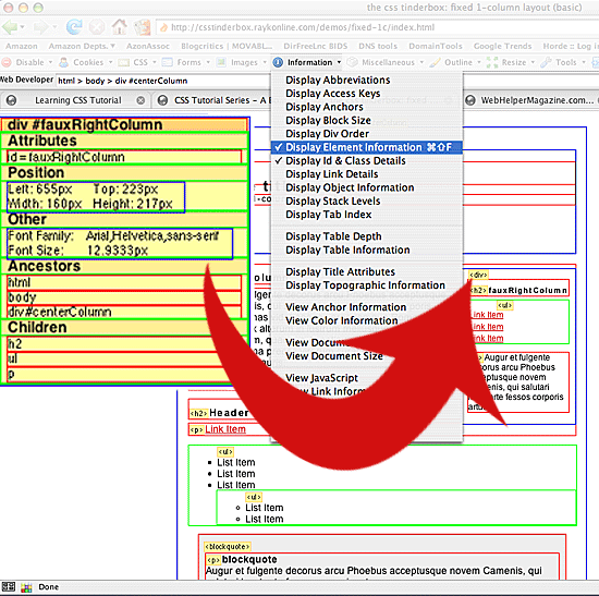
With “Display Element Information” turned on, you click on an element (DIV for right column shown above) to see more information about that element including its associated ID, and dimensions.
TIP: “Display Element Information” can also help you understand another key concept in CSS — the “Cascade” part of CSS. In the above illustration, the yellow box also lists “Ancestors,” and “Children” for a particular element. An Ancestor is a CSS element which has attributes (like the color of a Font, for example) which will affect the current element. A Child Element is one which may be affected by the current element, because it is beneath it in the “Cascade” – the sequence of style sheet code that your browser receives.
So, in our example above, if the “body” element called for a particular font color, then the fauxRightColumn div would use that font color unless you over-ride it. And likewise, any new font color you set in the DIV for fauxRightColumn would then be used in the “Children” headings, lists, and paragraphs.
7. Let’s take a look at the CSS code itself and review how the code for the Right Column is written. To do this we’ll select “Edit CSS” under the CSS menu (“View CSS” would show the code too — in a separate window, while “Edit CSS” will allow us to see the code beside the layout for quicker comparisons).
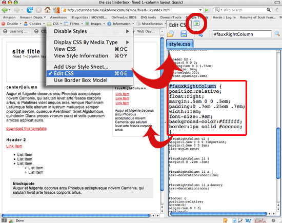
Above at top left, the circled icon, when clicked, repositions the CSS editing window on the top, bottom, left, or right of the screen. “Edit CSS” opens the CSS Editing window – yes, you can change the code and see live updates on screen! The code for the fauxRightColumn is boxed in Red. It was easily found in the editor by typing its name in the search box at top right, and clicking on the search icon (the magnifying glass). Using this method, we can quickly find the code we wish to review, view it side by side with your layout, and make code changes (try changing the margins and padding) and see immediate updates on screen.
8. We’ll close this lesson with a comparison of the general box model chart we started with, to the actual right column box, but you have some more homework to do. I suggest you use this lesson’s steps to review the Header, BlockQuote, and Footer elements. Use edit CSS to make changes in the code to the dimensions of each element until the way the “boxes” expand and contract becomes clear to you.
But first we’ll take a closer look at the right column set-up and see how it relates to our Box Model Chart:
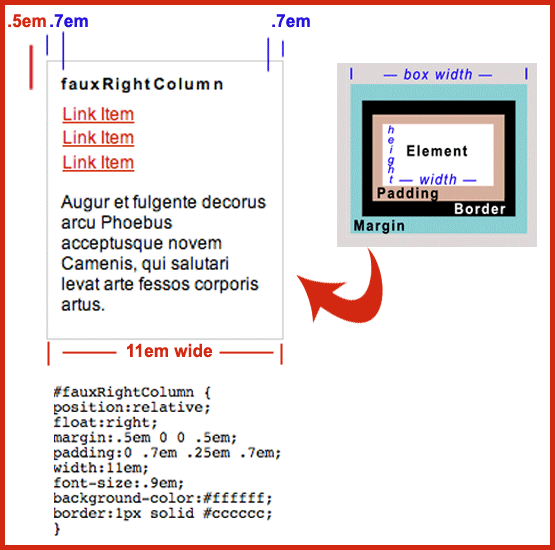
Above you can see how the CSS code for the Right Column element (bottom), creates a boxed area in the layout (top left), that corresponds to the general Box Model Concept (top right). We can see that the width of the element itself – the first “box” in our model, – is 11em. Next, the padding for the element creates a .7em box around the first box. Then there is a 1 pixel border box around the first two boxed areas. Finally, the margin creates yet another “box” around this element and there are two sides (left and bottom) of the box which carry a .5em margin.
Questions & Answers:
When learning CSS, each new concept and its application usually leads you to more questions, so here are some likely questions with their answers that may have come up in this lesson:
Why is there 0 space for margin set for the fauxRightColumn box on the top and right of it? That’s because the padding for the centerColumn element and the margin for the Header element create the space needed on the top and right of the fauxRightColumn box.
How do the margin dimensions given in four numbers relate to the sides of the “box” around an element? The order goes Top, Right, Bottom, Left — like starting at 12 o’clock and proceeding clockwise. So… writing margin:.5em 0 0 .5em; means there would be .5em space on top, 0 on the right and bottom, and .5em space on the left side of an element.
Why use “ems” instead of pixels (“px”) for padding and margin measurements? The choice is yours, but understand that pixels are static, representing precise units of space, while ems are dynamic in the sense that they are tied to the font size being used. Since users can change the size of fonts using their browser menu, from say 12 pt type to 20 pt type, web designers who want the space to change by the same amount for a margin or for padding, use “ems”. Remember that you may also choose to use actual percentages (%), or centimeters (cm) as values.
TIP: To better understand units of measurement and how they affect your layout, simply use the method given in this lesson to open the Web Developer CSS Editing window and type in different measurement values. Then try changing your browser’s text-size (under the View menu in Firefox), and watch what happens.
Are tables finished for web page layout? CSS is much more efficient (less code) and flexible, once you learn it. You’ll have more control with CSS. If you’ve ever slogged through “nested” tables (tables within tables) to achieve a layout, CSS is a great breath of fresh air. It is also a better way to separate content from layout code so that your data becomes accessible for use in “Web 2.0” methods involving XML. Use CSS for what it is great at – page layout. Use tables for what they are good at – organizing data in rows and columns, like spreadsheets do.
Do you have another question for Scott? You can write him at Scott [at] webhelpernow.com – he’ll work your questions (and their answers) into forthcoming lessons.
About the Author: Scott Frangos is a web developer, college instructor, illustrator, and graphic designer. He is Managing Editor for WebHelperMagazine, and is also writing two forthcoming books for Web Masters. He lives in Portland, Oregon with wife and partner, Pepper, and their three dogs: Wisdom, Spirit, & Steggman.
Learning CSS is an evolving series of articles which you may access in any order, depending on your level of knowledge and needs. The series covers major CSS concepts like the Box Model, Syntax, Layout Controls, and ways to visually understand the structure of CSS.